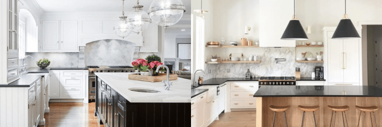
17 Small Kitchen Cabinet Color Ideas: Transforming Your Space with the Power of Color
Small kitchen? No problem.
With the right cabinet color, even the tiniest space can feel bright, stylish, and full of charm. Color has the power to open up a room, create a mood, and add personality—without knocking down a single wall.
I’ve seen dull, cramped kitchens turn into cozy little showstoppers with just a few brushstrokes.
This list is packed with fresh, fun, and foolproof cabinet color ideas made just for small kitchens. Whether you love soft neutrals or bold tones, there’s something here that’ll make your space pop.
Let’s dive in and find the perfect shade for your small but mighty kitchen.
How to Select a Small Kitchen Cabinet Color?
Choosing the right color for your kitchen cabinets can feel a little overwhelming—especially when your space is small. But don’t worry, I’ve got you.
Let’s walk through some tips that actually make the process fun and simple.
1. Think About the Light in Your Kitchen
Natural light can change everything. If your kitchen gets lots of sunlight, you can play with deeper or richer tones—like navy or forest green.
But if it’s a bit dark and cozy, go with light colors. Think soft whites, pale greys, or warm beiges. These bounce light around and make your kitchen feel more open.
2. Look at Your Countertops and Flooring
You don’t need to match everything exactly—but they should complement each other.
Have marble countertops with grey veining?
Try dove grey or soft sage cabinets. Got warm wood floors? Cream, muted green, or even a dusty rose can work beautifully.
Here’s a simple trick:
Take a photo of your kitchen and test color samples right on the image using apps like Canva or Pinterest boards. It helps visualize the whole look.
3. Consider the Vibe You Want
Are you dreaming of a modern look? Go for bold contrasts like black and white.
Want something cozy and charming? Soft pastels or earthy tones do the trick.
Prefer timeless? You can’t go wrong with neutral tones like ivory, grey, or taupe.
Try this: Grab inspiration from your favorite coffee shop, hotel, or even a piece of clothing you love. If that mustard yellow coat makes you happy, why not a pop of that color in your cabinets?
4. Play with Two-Tone or Accent Cabinets
You don’t have to stick with one color. In small kitchens, painting upper cabinets a lighter shade and lower cabinets a slightly darker tone can make a big difference.
It breaks up the space and adds depth without overwhelming it.
Real-life inspo: One homeowner I worked with used white uppers and pale blue lowers. Her tiny kitchen instantly looked fresh and full of personality.
5. Test Before You Commit
This one’s important. Colors can look totally different depending on the lighting and time of day. Paint a small area or use peel-and-stick samples before making your final decision.
Trust me—what looks grey on the swatch might look blue on your wall. Always test it first.
1. Tranquil Sage & Gold Elegance

This soft, muted green creates an instantly calming atmosphere that I absolutely love for kitchens of any size. It’s like bringing a breath of fresh air indoors!
Pair it with gold hardware to create a luxurious yet understated look that elevates the entire space.
I’ve found that white quartz countertops make the perfect partner, brightening the room while letting the dusty green take center stage. Want to add some character?
Try a vintage-inspired runner rug to bring warmth and texture that grounds your design. This color works amazingly well in both natural and artificial lighting, maintaining its sophisticated charm throughout the day.
2. Vibrant Teal Farmhouse

I’m obsessed with how teal cabinets instantly infuse kitchens with personality and vibrant energy! This bold choice creates a statement that’s both refreshing and timeless.
You’ll love how this color pops against natural stone walls or neutral countertops. I recommend pairing teal with farmhouse elements like apron sinks and wooden open shelving to create that perfect country-inspired coziness.
Under-cabinet lighting is your secret weapon here—it enhances the depth of the teal, creating a gorgeous glow in the evenings. Not ready to commit to all-teal?
Try using it on your island while keeping perimeter cabinets neutral for a balanced approach that still delivers that wow factor.
3. Cozy Woodland Green Retreat

There’s something magically inviting about deep forest green cabinets that makes your kitchen feel like a warm hug.
I’ve noticed this rich, earthy tone creates instant coziness while still feeling sophisticated and grown-up.
You’ll find it pairs beautifully with natural wood walls or accents, creating a woodland-inspired retreat right in your home. Black countertops and backsplashes provide striking contrast that makes the green pop even more.
I love adding brass sconces and copper cookware to enhance the organic, lived-in feel. This color works perfectly year-round but feels especially appropriate during fall and winter months when we crave that extra touch of warmth and comfort in our spaces.
4. Timeless Navy Accent Classic

I’ve always found that this timeless combination offers the perfect balance of brightness and depth. Your white cabinets create a clean, spacious feel while the navy subway tile backsplash adds that punch of personality without overwhelming the space.
I recommend adding light gray barstools to soften the contrast and tie everything together. The beauty of this combo?
You can easily update accessories as trends change while your cabinet foundation remains eternally stylish.
Try adding brass hardware for warmth or stainless for a more contemporary look.
This color scheme works wonders in kitchens of all sizes—making small spaces feel larger and giving large kitchens a crisp, defined character that never goes out of style.
5. Natural Olive & Marble Statement

I’ve fallen in love with olive green cabinets for their unique ability to feel both trendy and timeless simultaneously. This earthy tone brings the outdoors in, creating a grounded yet sophisticated space that welcomes family and friends.
You’ll be amazed at how black hardware creates sharp definition against the green, while marble countertops add that touch of luxury we all crave.
I’ve found that this color absolutely glows in natural light, so consider maximizing your windows if possible.
The beauty of olive is its versatility—it plays well with both modern and rustic elements, allowing you to change decorative accents over time while your cabinets remain the perfect backdrop for years to come.
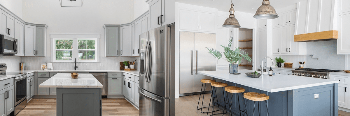
6. Versatile Greige Calm

I’m constantly recommending this muted gray-beige (greige) option to friends who want a space that feels current yet won’t date quickly.
You’ll love how this subtle neutral creates a soft, calming kitchen atmosphere while still offering more character than plain white.
I suggest gold knobs and pulls to add a touch of warmth and elegance that elevates the entire look. What makes this color so special is how it shifts subtly throughout the day as lighting changes, creating visual interest without being demanding.
The vertical paneling detail gives that cozy, farmhouse feel while maintaining clean lines.
This color creates the perfect backdrop for both colorful accessories and natural elements like wooden cutting boards, plants, or fruit displays.
7. Navy & White Balance

Why choose just one color when you can have the best of both worlds? I’m seeing more kitchens embracing this navy and white combination for good reason.
You get the brightness and timelessness of white uppers while the navy base cabinets ground the space with sophisticated color. I love adding industrial pendant lights that draw the eye downward and create focal points in the space.
The beauty of this approach is its versatility—you can easily incorporate wooden accents, colorful accessories, or metallic hardware that complements both cabinet colors.
This combination works especially well in kitchens with open floor plans, as it helps define the kitchen zone while maintaining visual flow with the rest of your space.
8. Refreshing Mint Breeze

This soft, refreshing shade feels like a cool breeze in your kitchen space! I love how mint green cabinets create an instantly uplifting atmosphere that’s both current and nostalgic.
You’ll notice it pairs beautifully with gold hardware for a touch of subtle luxury. I recommend white quartz countertops to maintain that light, airy feel throughout.
What makes this color special is its chameleon-like quality—it can lean modern or vintage depending on your styling choices.
Try adding woven textiles and warm wood flooring to balance the coolness of the mint with natural warmth.
This color works wonderfully in kitchens that need brightening, as it reflects light beautifully and makes spaces feel more expansive and welcoming.
9. Rich Forest & Brass Luxury

There’s something undeniably rich and sophisticated about dark forest green cabinetry that makes a kitchen feel both timeless and on-trend.
I adore how this deep, saturated color creates instant ambiance and acts as a gorgeous neutral that works with virtually any style.
You’ll find brass hardware and lighting fixtures pop brilliantly against this background, adding warmth and a touch of luxury. I recommend incorporating open wooden shelving to break up the color and display favorite pieces.
The contrast of a marble island against these deep cabinets creates a beautiful tension between elegance and earthiness.
This color isn’t just for large kitchens—in smaller spaces, it creates a jewel-box effect that feels intentional and cozy.
10. Bold Emerald Jewel Box

I’m obsessed with how emerald green cabinets instantly transform a kitchen from ordinary to extraordinary! This rich, saturated color exudes confidence and creates a space that feels both bold and sophisticated.
You’ll love how gold hardware pops against this jewel tone, adding that perfect touch of glamour.
I recommend balancing this strong color with natural elements like wooden beams or open shelving to keep the space feeling warm and inviting.
The patterned tile flooring creates an unexpected artistic element that completes the look.
Don’t be afraid of this color in smaller kitchens—when done right, it creates a stunning jewel-box effect that guests will remember long after they’ve left your home.
11. Timeless Walnut Heritage

There’s something timelessly appealing about rich walnut cabinets that just can’t be matched by painted finishes. I love how this natural material brings instant warmth and character to kitchens of all sizes.
You’ll notice how the varying wood grain creates visual interest without needing additional embellishment.
I find gold hardware provides the perfect complement, enhancing the wood’s natural richness without competing for attention.
The neutral countertops and backsplash let the walnut shine as the star of the show. What makes this choice special is its enduring appeal—while color trends come and go, beautiful wood cabinets remain desirable decade after decade.
Plus, they hide everyday kitchen wear and tear better than lighter finishes, making them practical for busy households.
12. Peaceful Sage & Black Contrast

I’ve always found sage green creates an instantly calming kitchen atmosphere that feels both fresh and timeless. This gentle color brings the outdoors in without overwhelming your space.
You’ll love how it pairs beautifully with white countertops, creating a clean, airy look that works in kitchens of all sizes. I recommend black hardware for that perfect touch of definition and contrast.
What makes sage special is its chameleon-like quality—it can feel traditional with classic fixtures or modern with sleek lines.
Adding wooden elements like open shelving or flooring brings natural warmth that balances the coolness of the sage beautifully. This color is especially forgiving with everyday kitchen messes, making it practical as well as pretty!
13. Refined Moss & Brass Harmony

This deeper, more saturated green creates an instantly luxurious feel that I find both grounding and refined.
You’ll notice how moss green cabinets make a statement without shouting, offering sophisticated color that still functions beautifully as a neutral.
I love pairing this rich hue with brass pendant lights that add warmth and glow to the space. The contrast with warm white countertops creates perfect balance—neither too stark nor too heavy.
Black bar stools add that contemporary edge that keeps the look from feeling too traditional.
What makes this color special is its versatility throughout seasons—it feels fresh in spring, cool in summer, rich in fall, and cozy in winter, making it a truly year-round choice for your kitchen.
14. Dramatic Charcoal & Warm Wood

I’m seeing this dramatic combination everywhere lately, and for good reason! The contrast between charcoal black cabinets and warm wood creates instant visual interest that feels both modern and timeless.
You’ll love how the darkness adds depth and sophistication while the wooden island brings approachable warmth. I recommend gold fixtures to add that perfect metallic accent that makes everything feel more luxurious.
The open wooden shelving breaks up the black beautifully, preventing the space from feeling too heavy. This combination works especially well in kitchens with plenty of natural light, as the brightness balances the darker elements.
Not ready to commit fully? Try black lowers with wood uppers for a more balanced approach that still delivers dramatic impact.
15. Sophisticated Taupe Grain

There’s something incredibly sophisticated about taupe-stained wood cabinets that creates an instant sense of calm and luxury.
I love how this warm neutral tone showcases the beautiful wood grain while feeling more current than traditional brown stains.
You’ll notice how the brushed bronze hardware complements the cabinetry perfectly, adding subtle gleam without stealing the show. I recommend dark stone countertops for striking contrast that defines the workspace.
The marble backsplash adds that touch of luxury that elevates the entire design.
What makes this color special is its chameleon-like quality—it can feel organic and natural in a casual space or refined and polished in a more formal setting.
16. Nostalgic French Blue Romance

I’m completely charmed by this delicate blue that instantly creates a cozy, nostalgic feeling in any kitchen.
Your space will feel like a quaint European cottage with this soft, powdery blue paired with vintage-inspired details.
I love adding scalloped range hoods and brass fixtures to enhance the romantic, collected feel of this color palette. The floral wallpaper brings personality while butcher block countertops add essential warmth to balance the coolness of the blue.
What makes this color special is how it creates instant character without feeling trendy or temporary.
This blue works beautifully in spaces of all sizes but feels especially magical in smaller kitchens, where it creates a jewel-box effect that feels intentional and special rather than cramped.
17. Cheerful Vintage Powder Blue

There’s something inherently cheerful about powder blue cabinets that instantly brightens your kitchen atmosphere. I love how this soft color creates a vintage-inspired space with modern functionality.
You’ll notice brass hardware pops beautifully against this gentle background, adding warmth and character. I recommend classic white subway tiles for the backsplash—they’re timeless and let the cabinet color remain the star.
The farmhouse sink adds that perfect touch of cottage charm that completes the look. What makes powder blue special is its subtle color that reads almost as a neutral while still offering personality and warmth.
This shade works wonderfully in kitchens with limited natural light, as it helps reflect and maximize whatever brightness is available.